

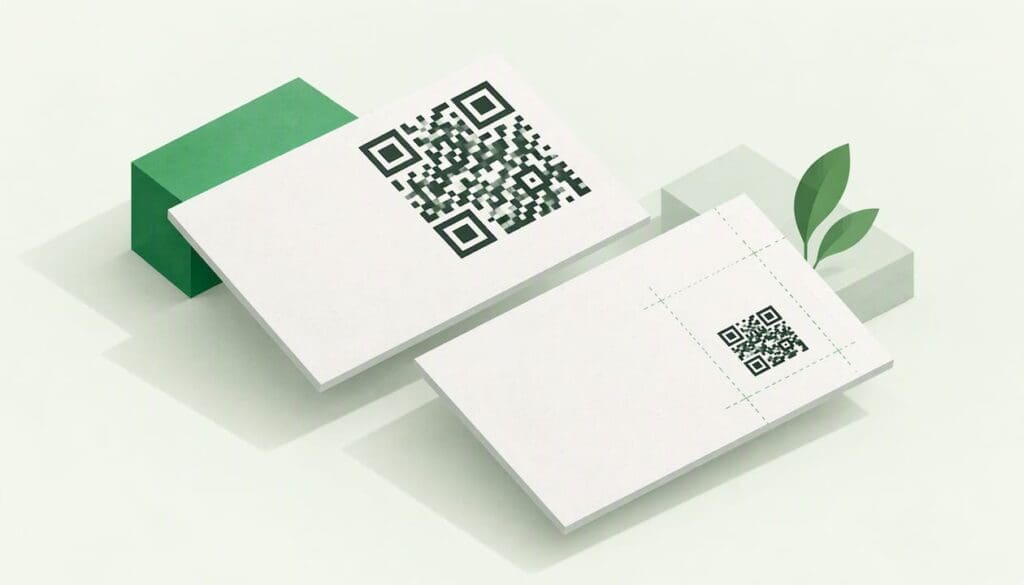
Put the QR code on the back of the card, well inside the trim line, at least 2 cm square on a plain, high-contrast background, with a short line beside it saying what the scan gives people. That placement keeps the front clean for your name and role, protects the code from the guillotine, and gives a phone camera the best chance of reading it first time. The rest of this guide covers the exceptions, the exact clearances, how to test a proof, and what the code should link to so the card still works in two years.
TL;DR
- Default to the back of the card, centred or in a lower corner with generous margins, and keep it away from edges, folds and rounded corners.
- Print it at 2 cm × 2 cm at the absolute minimum. Many NZ printers recommend more, so 2.5 to 3 cm is a safer working size.
- Use black on white, leave an empty border around the code, and avoid patterned backgrounds, overlapping text and glossy finishes.
- Add a few words of context next to the code, then scan a proof on more than one phone before you order.
- Link to something you can change later, so a new job title or phone number does not mean a reprint.
Table of Contents
- Front or back: where the QR code should go
- Keep the code away from edges, folds and glare
- How big the code should be, and how much space it needs
- Give people a reason to scan
- What the code should link to
- Test a proof before you print
- Our view: the card is the handover, the page is the product
- A live page behind your printed code
- A quick pre-print checklist
- FAQ
- Sources
Front or back: where the QR code should go
Most cards have two sides and one job each. The front says who you are. The back can say what to do next. That is why the usual advice is to put the code on the back, which keeps the front layout clean and keeps the code away from the card edges where trimming could clip it.
There are good reasons to break that rule, and they all come down to what the scan is for. QRNow’s business card guide ties placement to purpose:
| What the scan is for | Where it sits best | Why |
|---|---|---|
| Saving your contact details | Near your printed contact details, front or back | The reader links the code to the details it replaces |
| Scanning is the main goal | Centred, with room around it | It becomes the focal point and is hard to miss |
| A tidy, traditional front | Back of the card | The front keeps your name, role and logo uncluttered |
| Booking or following you | Beside a short call to action | The message tells people why to scan |
In practice, three layouts cover nearly every professional card.
Layout 1: single-sided front, code on the back
The front carries your name, role, business name and one or two contact lines. The back is mostly empty, with the code centred or sitting in one lower corner and a line such as “Scan to save my details”. This suits consultants, tradespeople, real estate agents and anyone whose card is handed over in a handshake. It is the safest choice for print quality because the back has room for a large code and a wide empty border.

Layout 2: code on the front, details beside it
If you want the scan to be the first thing someone sees, put the code on the front, in the lower right or lower left, with your name and role opposite. Keep it inside the safe area and give it the same clear border you would on the back. This works for event cards and sales teams who want every contact to reach a booking page. The cost is a busier front, so cut the text you do not need.
Layout 3: full-back code with a single message
Some cards turn the entire back into one large code with a two-line prompt. Size is your friend here: a larger code scans faster and from further away, which helps when someone is holding your card across a café table or at a trade-show stand.
Keep the code away from edges, folds and glare
Printers trim cards after printing, and no cutting process is perfectly exact. Anything too close to the edge can lose part of its border, and a code with a clipped border may fail to scan. Keep the whole code, including its empty margin, comfortably inside the trim line.
A few other placement traps:
- Rounded corners. If you order rounded cards, a code near a corner can lose its edge. Keep it central or well away from the radius.
- Folds. Folded cards put a crease through the pattern. Place the code on one panel, not across the fold.
- Busy backgrounds. Photos, textures and gradients behind the code reduce contrast. QRNow advises keeping the code off busy or textured backgrounds and away from glossy glare.
- Overlapping text or logos. Anything that crosses the modules (the small squares) can break the read. Leave the code alone in its own block.
Finish matters as much as layout. A high-gloss laminate throws reflections back at the phone camera, and a code that scans on your screen may struggle under an office downlight. Barcodes NZ advises avoiding highly reflective surfaces for QR codes. If you want a gloss card, put the code on a matt side or choose a matt finish across the card.
How big the code should be, and how much space it needs
Size is where most cards go wrong, because designers shrink the code to make the layout feel lighter. VistaPrint New Zealand’s troubleshooting page says a QR code should be at least 2 cm × 2 cm, and that larger codes are generally more reliable, especially when they hold more data. The same printer’s design guidance is more conservative and gives 31 mm × 31 mm as a minimum for printed codes.
Those two figures are not a contradiction. 2 cm is the floor where a simple code can still work. Around 3 cm is where you stop worrying. On a standard card you rarely have to choose between a readable code and a good layout, because the back is usually empty. If you want the maths and print specs in more detail, our guide to QR code size for business cards walks through the 2.5 to 3 cm range.
The empty border
Every code needs a blank margin, often called the quiet zone. VistaPrint’s guidance is to leave a border at least four times the size of the small squares. If your code is built from squares about 0.8 mm wide, that is a border of roughly 3 mm on every side. Count that border as part of the code when you check how close it sits to the card edge.
Contrast and colour
Black on white is the dependable option. Barcodes NZ identifies black and white as optimal for printing QR codes. Brand colours can work, but only if the code stays dark on a clearly lighter background. Avoid light-on-dark inversions, pale pastels and low-contrast combinations unless you have scanned a printed proof on several phones.
More data means a denser code
A code that holds a long web address or a full contact record has more, smaller squares than one holding a short link. Smaller squares at the same overall size are harder to read. This is one more reason to point the code at a short link that you control rather than cramming everything into the code itself. We cover that choice further down.
Give people a reason to scan
A code on its own is a small black square. People are cautious about scanning something with no explanation, and rightly so. Nielsen Norman Group’s QR code usability guidance says codes need clear, brief context and should lead to relevant pages, and that simply displaying a code does not guarantee anyone will act on it.
So put a short line next to it. Good ones name the outcome, not the technology:
- Save my contact details
- Book a 15-minute call
- See recent projects
- Connect on LinkedIn
Keep it to a handful of words, set in the same size as your contact details so it is readable. The same logic applies to where the code leads: it should land on a page that loads quickly on a phone and shows the thing the line promised, such as a mobile-friendly contact page with your number, email and a save button. Do not send someone to a homepage and make them hunt.
There is also a trust angle. Nielsen Norman Group notes that QR codes can lead to phishing, malware, unauthorised payments or tracking, and advises people to scan trusted sources, preview the destination and check for HTTPS. Your card is a trusted source only if the destination looks like you. Use your own domain, make sure it loads over HTTPS, and keep the page branded so the recipient sees immediately that they are in the right place.
What the code should link to
Choose the destination first, then design around it. QRNow lays out the options:
- A vCard if you want the recipient to save your details straight into their contacts.
- A URL for your website, portfolio, LinkedIn or another social profile.
- A landing page or booking link for appointments and enquiries.
The mistake is to pick one at random and then print 500 cards. A vCard stored directly inside the code is fixed at the moment you print it. If you change phone number or role, every card in your drawer is out of date. A URL-based code is different: according to QRNow, the destination can be updated later without reprinting the card.
That is the practical difference between a static and a dynamic setup. With a static code, the data is the code. With a dynamic one, the code points at a short link, and you change where that link leads. For a business card that may sit in a wallet for a year, the second approach is almost always the right one. We look at how long codes stay reliable in do QR codes expire, including why we suggest re-testing at one week and again at six months.
Test a proof before you print
A scan on your monitor proves very little. The checks that count happen at print size.
- Make a PDF proof. VistaPrint’s workflow is to create a PDF proof, check the code at actual size, then scan it before ordering.
- Preview the layout. Use the printer’s preview to check how the design will trim, and confirm the code’s border sits inside the safe area. VistaPrint’s advice is to preview and then scan with a phone.
- Print one at home or at the office. A single sheet at 100% scale is enough to catch problems with size and contrast.
- Scan on several phones. Barcodes NZ advises testing on different phones before final printing. Try an older Android handset and a recent iPhone, in daylight and under indoor lighting.
- Check the landing page too. Scan, wait for the page, tap the main button. If it takes longer than a few seconds on mobile data, fix the page, not the code.
- Run a final test on the delivered cards. Once the box arrives, scan one from the batch before you hand any out. A pre-launch checklist like this one shows the same habit of previewing and confirming a QR code scans on different devices.
If a card fails, work through size, contrast, border, finish and data density in that order. Our guide to business card QR codes that won’t scan goes through each one.
Our view: the card is the handover, the page is the product
We build digital business cards, so we see the same pattern over and over. People spend an hour on where the code sits and thirty seconds on where it goes. The placement matters, and everything above is worth doing. But the placement only gets someone to the page. What happens next decides whether the card did its job.
Three things follow from that.
First, a printed card is a snapshot. Roles change, numbers change, a business rebrands. A printed code that points at a page you control survives all of that. A printed code that holds fixed information does not.
Second, teams multiply the problem. One person reprinting is annoying. Twenty staff with different versions of the logo and a former employee’s number still circulating is a branding problem. That is the reason we built central management into EcoCard: an administrator can update roles, details and branding across every card, and handle onboarding and offboarding without chasing reprints.

Third, the person scanning should not have to install anything. Recipients open an EcoCard in their browser, so there is no app to download between the scan and your details.
Our advice is simple. Use the printed code where it helps, put it on the back with a clear border, and point it at a live page. If you want to see what that page looks like in practice, our digital business card examples show a range of layouts built for phones.
— Chris
A live page behind your printed code
If you want the printed code and the page behind it handled in one place, EcoCard gives you a digital business card you can share by QR code, direct link or NFC tap, with contact details, social profiles, links, portfolio and documents on one page that updates live. The Individual plan is 9.99 NZD per month, and extra cards for another role or business are 4.99 NZD per month each. For small teams, Starter is 19.99 NZD per month, Business is 49.99 NZD per month and Teams is 99.99 NZD per month. Enterprise is priced on request. See how it works or read about creating a secure, live digital business card.
A quick pre-print checklist
| Check | Target |
|---|---|
| Side of the card | Back by default; front only if the scan is the main aim |
| Size | 2 cm × 2 cm at minimum, ideally 2.5 to 3 cm or more |
| Border | Empty margin of at least four small squares on every side |
| Distance from trim | Whole code and border well inside the edge, away from folds and rounded corners |
| Colours | Dark code on a plain, light background, ideally black on white |
| Finish | Matt or a non-reflective area behind the code |
| Context line | A few words saying what the scan gives |
| Destination | Your own HTTPS page, changeable without reprinting |
| Testing | PDF proof at actual size, then scans on several phones |
FAQ
Is it a good idea to put a QR code on a business card?
Yes, if it saves the recipient effort and goes somewhere useful. A code with no explanation or a poor mobile page is wasted space, because displaying a code does not guarantee action. Add a short prompt and link to a page that loads quickly on a phone.
Should the QR code go on the front or the back?
The back is the standard choice because it keeps your name and details uncluttered and keeps the code away from trimmed edges. Use the front only when scanning is the main purpose of the card, and still keep the code and its border inside the safe area.
How big should the QR code be on a business card?
Aim for 2.5 to 3 cm. VistaPrint New Zealand gives 2 cm × 2 cm as a minimum and a more conservative 31 mm × 31 mm in its design guidance. Larger is generally more reliable, especially when the code holds more data.
Which type of QR code is best for a business card?
For most people, a dynamic code that points to a URL, because you can change the destination later without reprinting. A vCard code suits people who only want to hand over contact details and rarely change them. If your details change often or you manage a team, a live page is easier to keep current.
How do I check the code works before ordering?
Create a PDF proof, view it at actual size and scan it, then print one test copy and try it on a few different phones. Check the landing page on mobile data as well, since a slow page feels like a broken code.
Sources
- How do I add a QR code to my design? (VistaPrint New Zealand Help Centre)
- How do I fix a QR code that won’t scan? (VistaPrint New Zealand Help Centre)
- How to Use QR Codes on Business Cards: Full Guide (QRNow)
- 13 QR-Code Usability Guidelines (Nielsen Norman Group)
- Buy QR Code Images (Barcodes NZ)
- QR code stamp card setup guide (Beepify Blog)
- Mobile touch page (Essex Telephone Systems)
Recommended
- Make QR Code Business Cards Print Ready for Professionals: 2 cm Min
- Business Card QR Codes Won’t Scan? Check 2 cm Print Specs, Then Test
- Print Ready QR Code Size for Professionals: 2.5–3.0 cm Business Cards
- NFC Business Cards: Why QR Still Matters When Taps Fail
This article was produced with AI assistance and reviewed for accuracy. It is provided for general information only and is not professional advice.

