


Here are 15 practical digital business card examples you can copy to get faster follow-ups and cleaner contact sharing. This is an examples-first guide: real use cases matched to roles, plus the design rules, sharing tech and templates behind them. EcoCard appears throughout as one in-market option for professionals who want to build a card from these patterns without asking anyone to download an app.
TL;DR:
- Digital business cards should have one primary call to action, such as a booking link or “save contact” button, with supporting fields kept minimal.
- Best sharing methods vary: QR codes for in-person exchange, NFC for quick face-to-face taps, and short links for email or social media where typing is involved.
- Templates and inspiration can be found on design galleries, curated lists, and platform-specific demos, but must be mobile-optimized and support a single click CTA.
- Avoid clutter by including too many actions, using outdated information, or sharing sensitive contact details without privacy measures, and always use analytics.
- Platforms like EcoCard facilitate quick creation, live updates, centralized management, and multiple sharing options, suitable for solo professionals and teams alike.
Table of Contents
- 1. Ten digital business card examples you can adapt today
- 2. How do you design a card that looks sharp on a phone?
- 3. Which sharing method fits your situation?
- 4. Where can you find templates and design inspiration?
- 5. How EcoCard supports these examples in practice
- 6. Common mistakes to avoid in digital business card design
- 7. Comparing popular digital business card platforms
- 8. Three priorities, one checklist
- 9. Build your card in minutes, not days
- Sources
- FAQ
1. Ten digital business card examples you can adapt today
Every card below is built around one job: get the right information in front of the right person, fast. Copy the structure, swap the details.
- Networking event card: name, role and company, plus a single “Save my contact” button as the primary call to action.
- Sales follow-up card: a calendar booking link as the hero action, with phone and email tucked below the fold.
- Speaker or slide download card: a “Download slides” button front and centre, with a short bio and event name for context.
- Freelancer portfolio card: three portfolio thumbnails above the contact details, linking straight to a work sample.
- Recruiter or hiring contact card: a link to current role listings as the main action, with a “Book a call” secondary option.
- Hospitality or retail card: a booking or reservation button up top, with location and opening hours as supporting fields.
- Real estate card: a property gallery link as the hero, plus a licence number and a direct enquiry button.
- Consultant card: a case study link as the primary CTA, with a short specialism line instead of a generic job title.
- Remote services card: a visible timezone and a booking link, since remote clients need to know when you are actually available.
- Team or role-switching card: one profile that lets a staff member flip between two roles, such as sales and support, without carrying two separate cards.
For each of these, keep it to one primary CTA and two or three supporting fields. Adding a booking link or portfolio link rather than a bare phone number tends to produce a clearer next action, and cards that include an analytics view let you see whether people are actually tapping the CTA or scrolling past it.
2. How do you design a card that looks sharp on a phone?
Most digital business cards are opened on a phone screen within seconds of being shared, so the design has to work at thumb width, not desktop width.
Six rules cover most of it:
- Design mobile-first: build for a phone screen, then check how it looks wider.
- Use one primary call to action per card, not three competing buttons.
- Choose readable typography: a clear sans-serif at a size that does not need zooming.
- Add one brand colour accent rather than a full palette.
- Use a sharp, well-lit photo or thumbnail, never a stretched or pixelated one.
- Keep a clear contact hierarchy: name and role first, action second, everything else below.
Three visual patterns cover most professions. A minimal contact-first layout suits anyone whose job is the relationship, such as a consultant or an account manager. A portfolio-first layout suits freelancers and creatives who need the work to speak before the pitch does. An event or speaker layout puts the talk title and a download link above the fold, with contact details as a secondary block.
Microcopy matters more than it should: “Kate Nguyen, Landscape Architect” reads better than “Kate Nguyen | Founder & Principal”, and “Book 15 minutes” converts better than “Contact me”.
Pro Tip: Write your CTA button as an action, not a noun, “Book a call” beats “Contact”.

3. Which sharing method fits your situation?
The right sharing method depends on the moment, not just the device.
- QR code: best for in-person handoffs, printed on a lanyard, table tent or the back of a laptop lid.
- NFC tap: fastest for a genuine face-to-face exchange, works on most modern phones with no app needed on the receiving end.
- Short link: best for email signatures, social bios and slide decks, since it is typeable and trackable.
- Email signature: keeps your card in front of every person you already correspond with, no extra step required.
Place a QR code where a phone camera can reach it without awkward angles, and point every link to a single-click contact save or a direct calendar booking rather than a generic homepage. For anyone uneasy about handing out a personal number on first contact, hide the direct phone or email behind a short lead form or a PIN, and only reveal it once the enquiry is genuine.
4. Where can you find templates and design inspiration?
Four sources cover most of what you need before you build anything from scratch. Design galleries such as Dribbble’s digital business card tag show hundreds of layout and animation ideas, though they are best used for inspiration rather than as ready templates. Curated roundups like Creative Boom’s 2026 business card design list highlight recurring motifs worth matching to your profession. Platform template libraries, including profile-page demos such as the Bloglo WordPress theme, can be repurposed as a mobile landing page if the demo previews cleanly on a phone. EcoCard’s own examples gallery shows live sample cards you can copy directly.
When judging any template, check three things: does the mobile preview look clean, are the fields actually editable, and does it support a single-click CTA. Watch for bold colour blocks, animated thumbnails and minimal layouts, all common in current design trends.
5. How EcoCard supports these examples in practice
EcoCard maps cleanly onto the examples above. An individual consultant can build a case-study-first card under the individual plan, with a live-updating link so a portfolio piece never goes stale. A business can issue a team role card through central admin management, keeping branding consistent while letting each staff member hold their own contact details. An event speaker can set up a slide-download card ahead of a talk and swap the CTA the moment the event ends, without reprinting anything.
Relevant features:
- Central admin control for consistent branding across every employee card.
- Live updates that push instantly to every card holder, no reprint needed.
- Multiple cards per user, useful for role-switching or side projects.
- NFC and QR sharing plus usage analytics, documented on the features page.
6. Common mistakes to avoid in digital business card design
The most common failure is packing in too many actions. A card with five buttons, phone, email, calendar, portfolio and a social link, leaves the viewer unsure what to tap, so pick one primary CTA and let the rest sit below it.
The second is a mismatched landing experience: sending someone to a homepage instead of a booking page or a direct contact save wastes the one moment they were ready to act. A third is stale information, particularly on printed QR codes, where a changed phone number or job title quietly breaks the card until someone notices.
Poor mobile formatting is common too: tiny text, a stretched photo or a button that sits half off-screen on smaller phones. So is ignoring privacy, sharing a personal mobile number by default when a lead form or a business line would do the same job with less exposure. Finally, plenty of cards skip analytics altogether, which means there is no way to tell whether the card is actually working or just sitting unopened in someone’s phone.
7. Comparing popular digital business card platforms
Most digital business card platforms fall into a few categories. Standalone consumer apps focus on a single personal card and often require the recipient to install the same app to save details properly. Link-in-bio tools, built for social media profiles, can double as a basic card but lack business features like team branding or admin control. CRM-linked tools sync a card directly to a sales pipeline, useful for larger sales teams already committed to that CRM. Platforms built specifically for business cards sit in between: no app required for the recipient, plus centrally managed branding for teams and individual plans for solo professionals.

The right choice depends on whether you are buying for yourself or for a team. A solo consultant mostly needs a clean, editable profile and a booking link. A business with a dozen staff needs consistent branding across every card and the ability to update or deactivate someone’s card the moment they leave, which is where centrally managed platforms pull ahead of single-user apps.
8. Three priorities, one checklist
Three things separate a card that works from one that gets ignored: clarity, a clear single action and effortless sharing. Everything else is decoration.
Before you publish, check that your card has one CTA, a current photo, a working link, a visible role and a sharing method suited to how you actually meet people.
— Chris
9. Build your card in minutes, not days
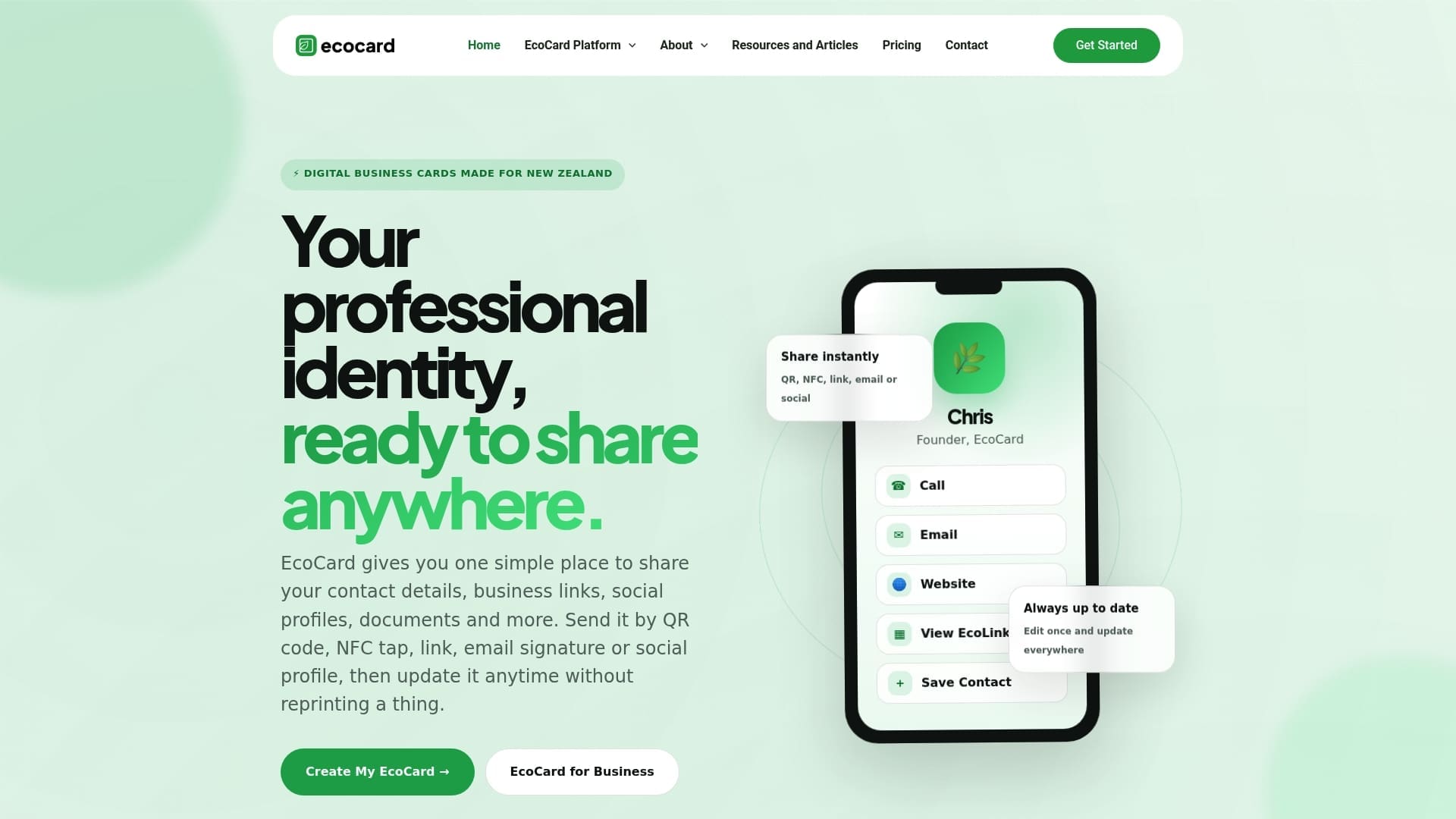
Every example above can be built on a digital business card platform that does not require contacts to install anything: NFC tap, QR code or a short link all work straight out of the box, and edits go live instantly across every card you manage.
Relevant features to start with:
- Ready-made layouts matching the examples in this guide.
- NFC and QR sharing alongside a shareable short link.
- Live updates that apply the moment you make a change, with no reprint.
Compare plans on the EcoCard pricing page and pick the one that matches whether you are building a single card or managing a whole team.
Sources
- Dribbble: digital business card tag
- 16 of the best business card designs to inspire you in 2026 | Creative Boom
- WordPress
FAQ
What should a digital business card look like?
A good digital business card leads with your name, role and a photo, followed by one clear call to action such as a booking link or a “save contact” button. Supporting details like social links or a portfolio sit below, not competing for attention at the top.
How do I create a digital business card?
Start by choosing a template built for mobile, add your name, role, photo and one primary CTA, then connect your sharing method of choice, QR, NFC or a short link. Platforms such as EcoCard let you build and edit a card through an individual plan without any design software.
Can I use my phone as a digital business card?
Yes, most modern phones can share a digital business card through NFC tap, a QR code shown on screen, or a direct link sent by text or email. The recipient does not need to install an app to save your details.
Are digital business cards a good idea?
For most professionals, yes: they stay current when your details change, support richer content like portfolio links, and cut the waste tied to printed cards. They work particularly well for anyone who networks often, since a saved digital card is harder to lose than a paper one.
What is the difference between a QR code and NFC sharing?
A QR code is scanned with a phone camera and works on virtually any device, making it reliable for in-person handoffs or printed materials. NFC uses a tap between two phones and is faster in a genuine face-to-face exchange, but both achieve the same result of sharing your card instantly.
Recommended
This article was produced with AI assistance and reviewed for accuracy. It is provided for general information only and is not professional advice.

