


The practical minimum for a scannable QR code on a business card is about 2.0 centimetres or 0.8 inches, but the reliable sweet spot sits at 2.5 to 3.0 centimetres, or 1.0 to 1.2 inches. Glossy stock, dense data and older phone cameras all push you toward the larger end. Print one card before you commit to a run and scan it yourself.
TL;DR:
- QR codes on business cards should be at least 2.5 to 3.0 centimeters in size for reliable scanning, especially under suboptimal lighting or with older phones.
- Using a lightweight data payload, such as a short URL or trimmed vCard, helps keep the code simpler and more scannable at smaller sizes.
- Incorporating a safety margin of 1.5 to 2 times the minimum size based on scanning distance improves real-world reliability.
- Vector files like SVG or PDF are preferred for printing, while high-resolution PNGs of 300 DPI are acceptable if vectors are unavailable; JPEG formats should be avoided.
- Proper placement, sufficient quiet zone, and testing under various conditions ensure the code remains discoverable and easy to scan during actual use.
Table of Contents
- Quick reference: sizes and scan distance for cards and print collateral
- Applying the distance-to-size formula with a practical safety margin
- File format and print setup for QR codes that actually scan
- Design and placement: where the code sits and how much room it needs
- How your encoded data changes the size you need
- Proofing checklist before you commit to a print run
- Balancing brand design against scan reliability
- EcoCard: reduce printed complexity with live, QR-enabled digital cards
- Sources
- FAQ
Quick reference: sizes and scan distance for cards and print collateral
Business cards are the tightest constraint you will face because the print area is small and the scanning distance is short, usually the length of an arm. Flyers and brochures give you more room to work with, so the size math changes accordingly.
For a business card, 2.5 to 3.0 centimetres is the size that balances scannability against the limited real estate on a card measuring roughly 9 by 5 centimetres. Going bigger than 3.5 centimetres usually looks clumsy and crowds out your name, title and contact details.
A few situations push you toward the top of that range rather than the bottom:
- Glossy or laminated finishes reflect light and reduce contrast, so add size to compensate.
- Logos embedded in the code raise the error correction level, which increases module density.
- Long encoded data, such as a full vCard, packs more modules into the same space and needs a larger print size to stay readable.
If none of those apply and you are encoding a short link, you can sit comfortably at the lower end of the recommended range.
Applying the distance-to-size formula with a practical safety margin
Print professionals size QR codes using a distance-to-size ratio, sometimes written as the 10:1 rule: divide the expected scanning distance by ten to get a base minimum width. A code scanned from 25 centimetres away, for instance, needs a base width of about 2.5 centimetres.

That base figure assumes ideal conditions: good lighting, a recent phone and a clean printed edge. Business cards rarely get ideal conditions. Someone might scan yours in a dim conference hall, holding an older handset, at a slight angle. That is why a safety margin of 1.5 to 2 times the base figure makes the result far more reliable in practice.
Two quick examples show how this plays out:
- A card handed over and scanned at 20 centimetres gives a base size of 2.0 centimetres. Apply a 1.5x margin and you land at 3.0 centimetres, which matches the top of the recommended range.
- A card scanned from further away, say 30 centimetres across a table, gives a base of 3.0 centimetres. A margin here would push you past what a business card can comfortably fit, which is a sign to shorten the scanning distance assumption rather than the code.
For most cards, working backward from the recommended 2.5 to 3.0 centimetre range and treating the formula as a sanity check is more useful than treating it as a strict calculation.
File format and print setup for QR codes that actually scan
Give your printer a vector file. SVG or PDF exports scale without any loss of sharpness, which matters because a QR code depends entirely on crisp, high-contrast edges between modules. If a vector export is not available and you must use a raster image, export the PNG at a minimum of 300 DPI at the final print size, not scaled up afterwards.
Avoid JPEG entirely. Its compression introduces soft edges and colour artefacts around fine detail, and a scanner reading a QR code depends on exact module boundaries to interpret the pattern. A blurred edge can turn a working code into one that fails intermittently.
Before sending files to print, run through a short checklist:
- Proof in CMYK, not RGB, so the colours a printer produces match what you approved on screen.
- Avoid metallic or iridescent inks on the code itself, since they reduce the contrast a scanner relies on.
- Keep the quiet zone, the blank border around the code, clear of text, logos or card edges.
- Embed fonts and flatten vector layers so nothing shifts or substitutes during the print run.
Pro Tip: Ask your printer for a physical proof, not just a digital PDF preview, since screen colours and paper colours rarely match exactly.
Design and placement: where the code sits and how much room it needs
Placing the QR code on the back of the card keeps the front clean for your name, title and logo, which most designers prefer for visual hierarchy. The trade-off is discoverability: some recipients never flip the card over. A code on the front, usually in a corner, trades a little visual space for a guarantee it gets seen.
Wherever you place it, protect the quiet zone. That border needs to stay clear of trim lines, borders and any text or graphic element, with several millimetres of breathing room on every side. A code crammed against the card’s edge is more likely to misread, especially after trimming introduces even small alignment shifts.
A short label, something like “Scan to connect” or “Scan for contact details”, removes any ambiguity about what the code does. It also signals intent, which matters when the code shares a corner with a logo or icon of similar size.
- Back placement suits a minimalist front design but relies on the recipient turning the card over.
- Front placement guarantees visibility but competes with your name and logo for space.
- A short label next to the code improves the chance someone actually scans it.
How your encoded data changes the size you need
The data you encode determines how dense the code’s modules are, and denser modules need more physical size to stay scannable. A full vCard, with name, phone, email, address and social links, produces a noticeably busier pattern than a short URL. Trimming the vCard to just name, phone and email reduces density considerably, and a short redirecting link reduces it further still.
For a business card, the practical move is to favour a short URL that redirects to a fuller profile page, or a trimmed vCard limited to the fields someone actually needs on first contact. That keeps the printed code simpler at the same physical size.
- Full vCard: dense modules, needs the top of the recommended size range.
- Trimmed vCard: moderate density, sits comfortably in the middle of the range.
- Short redirecting URL: the simplest pattern, most forgiving at smaller sizes.
Error correction adds another layer. Higher correction levels let you embed a logo in the centre of the code, but they also increase module density for the same data, which is one more reason to keep the encoded payload as lean as the card allows.
Proofing checklist before you commit to a print run
Sizing and formatting choices only prove themselves once you have a physical card in hand. Run through this sequence before ordering in bulk:
- Export the final file at the exact print size you intend to use, not a scaled version.
- Print a single card on the actual stock and finish you have chosen, glossy, matte or uncoated.
- Scan it with a flagship phone to confirm the basic design works.
- Scan it again with an older phone, ideally one three or more years old, since older cameras and slower autofocus expose problems newer phones mask.
- Test under typical lighting, including the dim, mixed lighting common at conferences and networking events.
A clean, fast scan on every device and lighting condition is a pass. Any hesitation, failed read or repeated attempt means you increase the code’s size, simplify the encoded data, or switch to a matte finish before printing more.
Pro Tip: Test the card under a hand or slight shadow too, since that is how most people naturally hold a card out for scanning at a networking event.

Balancing brand design against scan reliability
Card designers often treat the QR code as an afterthought, squeezed into whatever space is left once the logo and text are placed. That habit is backwards. A code that fails to scan wastes the entire point of putting it there, so size and placement deserve the same attention as the typography around them.
There is a lighter alternative worth knowing about: a digital business card removes the payload problem altogether, since the QR code just points to a profile that updates on its own rather than encoding every detail directly. EcoCard’s approach reflects that thinking, giving professionals a way to keep contact details current without redesigning a printed card every time something changes.
— Chris
EcoCard: reduce printed complexity with live, QR-enabled digital cards
A printed QR code has to carry every detail at once, which is exactly why dense payloads force you into larger sizes and stricter print rules. EcoCard sidesteps that constraint: your QR code or shareable link points to a profile that updates the moment your role, phone number or branding changes, so the printed or digital code itself never needs to carry more than a simple pointer.
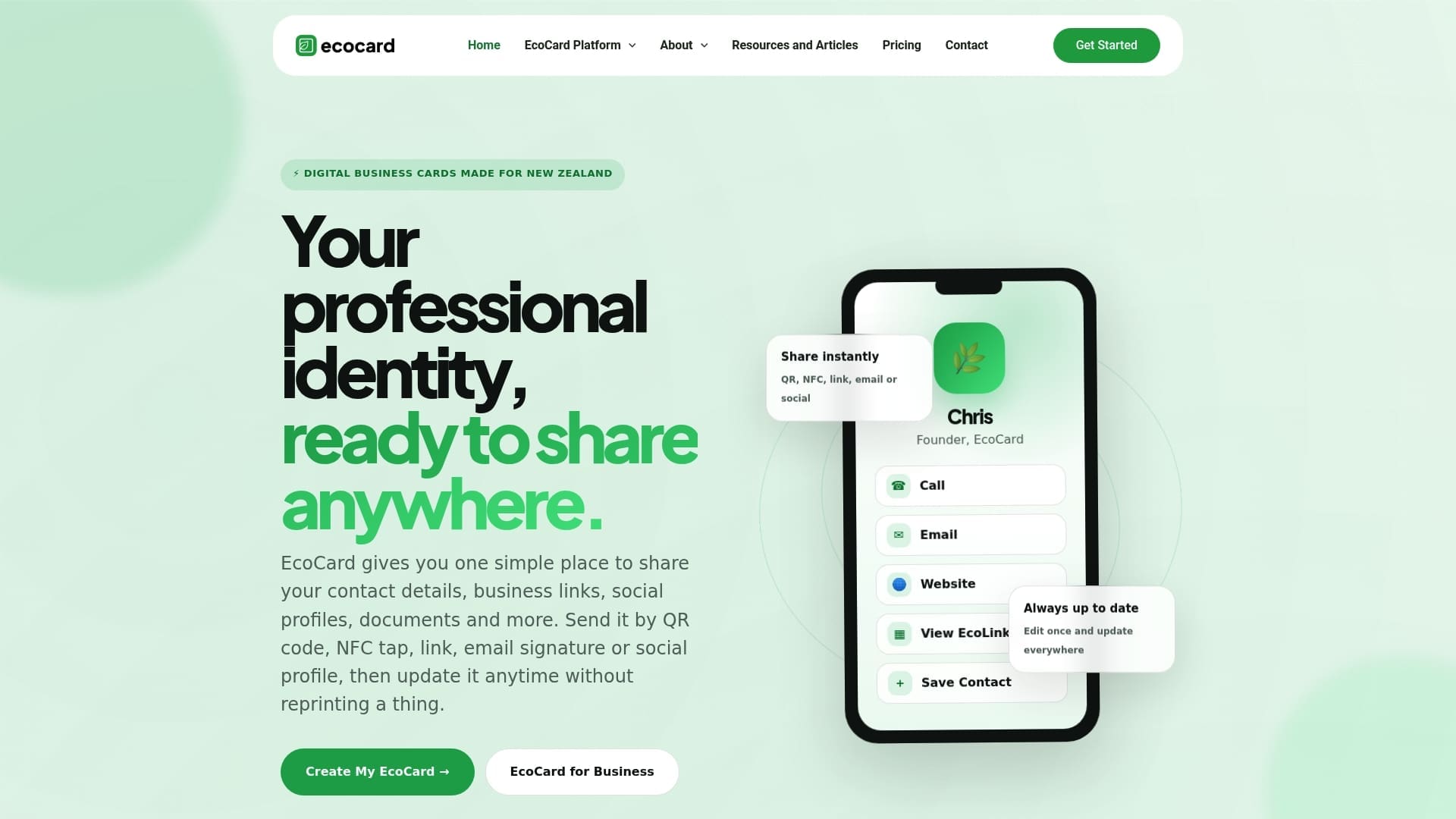
That matters most for teams. A business managing dozens of staff cards can update branding or contact details centrally through EcoCard for Business, rather than reprinting cards every time someone changes role. For an individual professional, the same benefit applies at a smaller scale: one profile, always current, shared through a QR code without the density trade-offs a printed vCard forces on you.
- One profile, always current, updated centrally instead of reprinted.
- No app required for the person receiving your card to view it.
- Centralised branding for teams managing multiple staff cards at once.
Plans start with the Individual option at $9.99 per month, with Business and Teams tiers available for larger groups. Check the pricing page for the full range of plans.
Sources
- QR Codes for Print & Business Cards (2026 Playbook) | EZQR
- How Big Should Your QR Code Be? The Print-Size Formula — QRSansar Blog
FAQ
What size should a QR code be on a business card?
Aim for 2.5 to 3.0 centimetres, or 1.0 to 1.2 inches, which scans reliably at typical handheld distances. The practical floor is about 2.0 centimetres, but that only works with simple data and a matte finish.
What is the ideal size for a QR code?
There is no single ideal size, since it depends on scanning distance, finish and how much data the code carries. For a business card specifically, 2.5 to 3.0 centimetres covers most situations reliably.
Which QR code is best for a business card?
A code encoding a short redirecting URL or a trimmed vCard scans more reliably at small sizes than a full vCard, because it produces a simpler, less dense pattern. Pairing that lighter payload with a printed size in the recommended range gives the most consistent results.
Should a QR code be a PNG or JPG?
Neither is the first choice: a vector format like SVG or PDF is preferred for print because it scales without losing sharp edges. If a raster file is unavoidable, export a PNG at a minimum of 300 DPI at final size, and avoid JPEG, since its compression softens the fine edges a scanner depends on.
Recommended
This article was produced with AI assistance and reviewed for accuracy. It is provided for general information only and is not professional advice.

