


Make QR codes accessible by pairing every code with alt text, a visible short URL, sufficient contrast and size, reachable placement, and a destination that meets accessibility standards on its own. A QR code that relies solely on scanning fails anyone using a screen reader, anyone with low vision, or anyone whose phone camera struggles in poor light. WCAG alignment is non-negotiable for public-sector work, and screening against New Zealand’s resources confirms it.
TL;DR:
- Ensuring QR codes have descriptive alt text and a visible short URL is essential for accessibility, in addition to maintaining 4.5:1 contrast and proper size.
- The placement of QR codes must be reachable, free of glare, and duplicated across multiple locations to account for physical and environmental constraints.
- The destination webpage must meet WCAG 2.2 Level AA standards independently, as a compliant code pointing to an inaccessible page is still unusable.
- Using higher error-correction levels and testing with assistive technology users reduces scanning failures for low-vision and motor-impaired individuals.
- Managing QR codes with centralized tools like Ecocard helps ensure consistent, up-to-date alt text, links, and accessibility compliance across an organization.
Table of Contents
- What is QR code accessibility and why does it matter here?
- Quick accessibility checklist (at-a-glance requirements)
- Design and visual requirements: contrast, colour, size, quiet zone, error correction
- Placement and physical context: where to put codes and how to avoid exclusion
- Digital implementation: alt text, link wrappers, ARIA and accessible names
- Fallbacks and multimodal alternatives: visible URLs, NFC and language options
- Testing and validation: automated checks plus real users
- Implementation checklist: audit steps and alt-text templates
- Accessibility considerations for users with cognitive disabilities
- Guidance on providing auditory feedback for QR code scanning
- Best practices for diverse environments: lighting and mobility constraints
- Designing for the person who can’t scan
- A managed approach to QR and link accessibility
- Sources
- FAQ
What is QR code accessibility and why does it matter here?
QR code accessibility means the code works for someone who cannot see it, cannot aim a camera precisely, or cannot physically reach it, not just for the person standing directly in front of it in good light. That distinction matters because a code is a graphical symbol first and a data carrier second. WCAG treats it as a meaningful non-text object, which means it inherits the same obligations as any image conveying information: a text alternative, adequate contrast, and a destination that stands on its own merits.
Most QR failures aren’t technical. They’re design decisions made without anyone checking whether a person using a screen reader, a wheelchair, or a low-end phone camera could actually complete the task. The fix is rarely complicated. It’s usually a missing line of alt text or a URL nobody bothered to print underneath the code.
Quick accessibility checklist (at-a-glance requirements)
Before any QR code goes to print or ships in a digital layout, run it against this list:
- Alt text and visible URL: every code needs descriptive alt text plus a short, human-readable URL printed alongside it, never the code alone.
- Contrast: 3:1 is the WCAG floor for graphical objects; aim for 4.5:1 as a working safety margin.
- Size and quiet zone: follow a minimum print size with a clear border (quiet zone) around the modules, and use error-correction level Q or H for anything printed.
- Placement: keep codes within comfortable reach for both seated and standing users, away from glare, with duplicates where one location won’t serve everyone.
- Destination: the landing page must meet WCAG independently. A compliant code pointing to a broken page is still a broken experience.
Treat this as a pre-deployment gate, not a wish list. If any item fails, the code doesn’t ship.
Design and visual requirements: contrast, colour, size, quiet zone, error correction
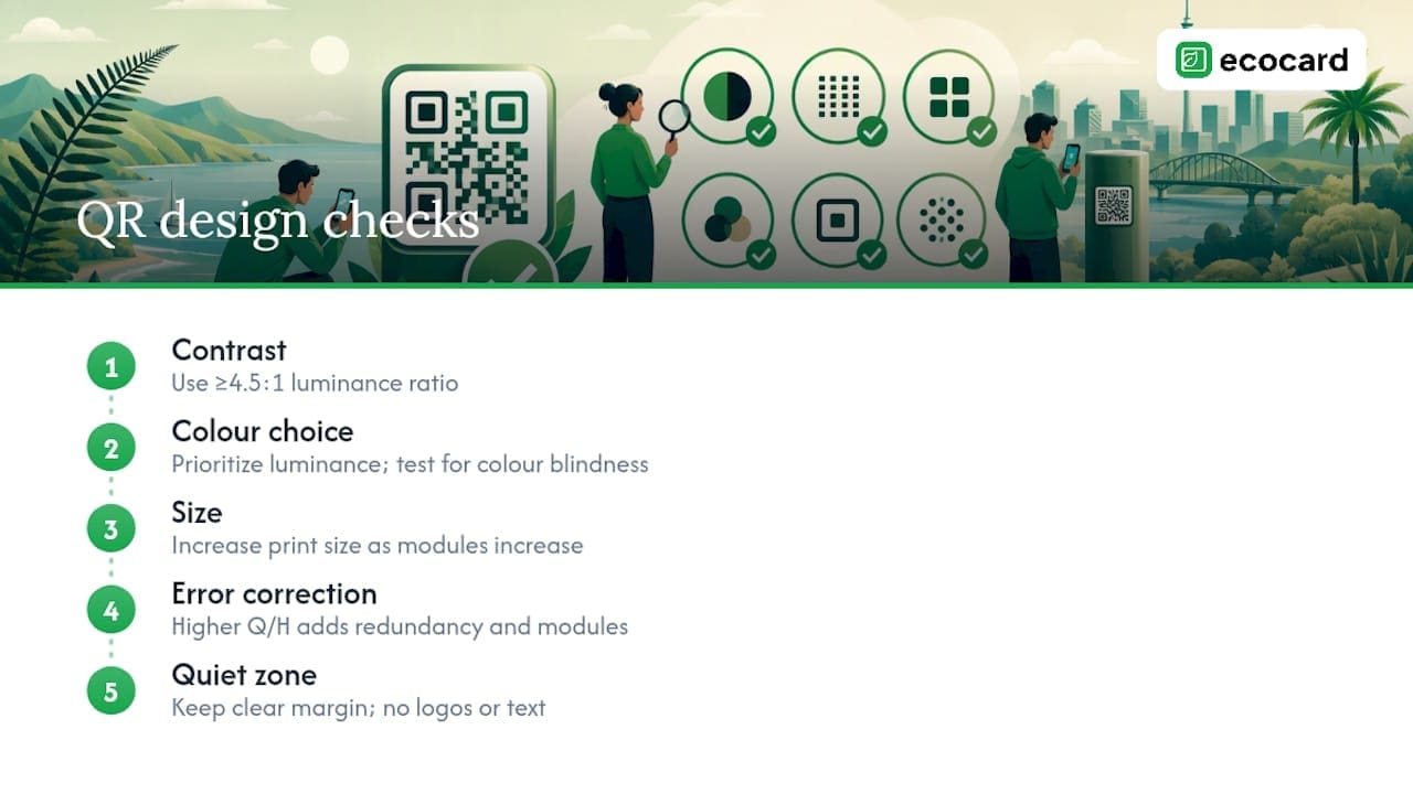
Contrast is where most QR codes quietly fail. WCAG’s success criteria for graphical objects set a 3:1 minimum, but that’s a technical floor, not a target. Print variables like ink bleed, paper stock, and ambient lighting eat into that margin fast, so a 4.5:1 ratio gives you a genuine buffer rather than a pass on a lab test.
Colour choice needs to prioritise luminance over hue. Two colours can look distinct to someone with typical vision and still collapse into near-identical greys for someone with colour vision deficiency. Test any branded colour pairing through a colour-blindness simulator before locking it in, and never rely on a colour difference alone to separate the modules from the background.
Size interacts directly with error correction. Higher error-correction levels (Q or H) add redundancy that helps a scanner recover from smudges, glare, or partial occlusion, but they also increase the number of modules, which means the code needs to print larger to keep each module scannable. Larger modules and higher error correction can materially improve scan reliability for people with low vision or limited fine motor control, so don’t shrink a code to fit a design without recalculating the error-correction trade-off.
Keep the quiet zone, the clear margin around the code, free of logos, text, or decorative elements. If a logo sits inside the code itself, it must not intrude into the functional modules. If your brand relies on light modules on a dark background, test that reverse-contrast variant on older phone cameras, because some scanners still struggle with inverted colour schemes even when the ratio technically passes.
Placement and physical context: where to put codes and how to avoid exclusion
A perfectly designed code fails if nobody can physically reach it. Placement rules deserve the same rigour as visual design.
- Centre codes at a height accessible to both seated and standing users, generally avoiding anything above 140 cm from the floor.
- Never mount a code where someone has to lean over a counter, crouch, or approach from an awkward angle to get a clean scan.
- Use matte finishes or angled mounting to cut glare from overhead lighting or direct sun, especially outdoors or near windows.
- Duplicate the code at more than one height or location when a single placement can’t serve everyone, such as a wall-mounted menu board also placed at table height.
- Keep a staffed or manual alternative available where the code supports a critical task like ordering, check-in, or payment, so a failed scan never becomes a dead end.
Physical accessibility is often an afterthought bolted on after the graphic design is finalised. It should be the first constraint you set, not the last one you check.
Digital implementation: alt text, link wrappers, ARIA and accessible names
On screens, a QR code is just another image, and it needs the same treatment as any other informative graphic. Alt text must describe both the purpose and the destination, not just state that an image is present. Write it the way you’d explain the code to someone over the phone: “QR code linking to the café’s lunch menu at shortlink.co.nz/menu,” not “QR code image.”
Wrap the QR graphic in an anchor element pointing to the same destination, or place a clearly labelled clickable link directly beside it. This gives keyboard and screen-reader users a way to reach the destination without ever needing a camera. The visible link text should match its purpose exactly. Don’t label it “click here” when “view the lunch menu” tells someone what they’re actually getting.
Where a QR code triggers an action rather than a simple page load, such as adding a contact or opening a payment flow, use aria-label or another accessible-name technique so assistive technology announces what will happen. Keep the visible label and the accessible name in sync. A mismatch between what’s printed and what a screen reader announces creates confusion, not clarity.
None of this matters if the landing page itself fails. Confirm every QR destination independently meets WCAG 2.2 Level AA, including caption and NZSL provisions for any video or audio content the code leads to.
Fallbacks and multimodal alternatives: visible URLs, NFC and language options
Print a short, legible URL next to every code, always. A custom short domain or a concise path is easier to read aloud, type from memory, or recognise at a glance than a long generated link. This single habit resolves most of the accessibility failures QR codes create in the first place.
Where budget and hardware allow, offer NFC tap as a parallel option. It removes the aiming and framing that scanning demands, which matters for anyone with limited fine motor control or low vision. At the destination, provide language switching or negotiation so the content isn’t locked to one language, and caption or NZSL any embedded media.
Keep a central registry mapping each short link to its live destination so fallbacks stay valid for the life of a campaign, not just its first week, and learn more about how to track these effectively in our guide on How to Track AI Traffic to Your Website.
Testing and validation: automated checks plus real users
Automated tools catch a real slice of QR accessibility problems, but never the whole picture. Run contrast checkers and markup validators as a first pass, then bring in people who actually use assistive technology day to day.
- Run automated scans through the Centralised Web Accessibility Checker (CWAC), which uses axe-core and tests across multiple viewport sizes.
- Follow the NZ Web Accessibility Standard 1.2 for any public-facing government or council work, which mandates WCAG 2.2 Level AA.
- Engage testers with vision and motor impairments directly, through organisations like the Association of Blind Citizens NZ or People First NZ, rather than assuming a compliant colour ratio equals a usable experience.
- Document every test result and keep a registry linking each code to its alt text, destination URL, and last review date.
CWAC is genuinely useful for repeatable checks, but automated testing only catches a portion of what WCAG actually requires. It won’t tell you whether a screen-reader user actually understood what the code was for.
Pro Tip: Keep a spreadsheet with one row per QR code: location, alt text, destination URL, contrast ratio, last test date, and tester name. When a regulator or a customer asks whether a code is compliant, you want an answer in thirty seconds, not a scramble through old design files.
Implementation checklist: audit steps and alt-text templates
Run every code through this sequence before it ships:
- Check contrast against the 4.5:1 target using a contrast analyser.
- Verify size and quiet zone match the print dimensions for the chosen error-correction level.
- Confirm alt text exists and describes both purpose and destination.
- Add a link wrapper or visible URL so the destination is reachable without scanning.
- Test the destination page independently against WCAG 2.2 Level AA.
- Run a real user test with at least one assistive-technology user before large print runs or launch.
Three alt-text templates worth copying directly:
- Menu: “QR code linking to the full lunch menu at shortlink.co.nz/menu.”
- Ticket: “QR code for event entry, scans to shortlink.co.nz/ticket12345.”
- Product info: “QR code linking to ingredient and allergen details at shortlink.co.nz/product88.”
For your registry, capture at minimum: code ID, physical location, destination URL, alt text, contrast ratio, error-correction level, and date last tested.
Accessibility considerations for users with cognitive disabilities
QR codes ask for a small chain of decisions most designers never notice: recognise the symbol, understand what it does, open a camera app, hold the phone steady, wait for recognition, then interpret whatever loads. For someone with a cognitive disability, memory impairment, or processing difference, any link in that chain can break the whole interaction.
Reduce the cognitive load wherever you can. Pair the code with a short, plain-language instruction such as “Scan for menu” or “Tap here for details” rather than assuming the icon speaks for itself. Keep the instruction consistent across every code in the same environment. If one sign says “scan to order” and another says “point camera here,” you’ve just added a decision that didn’t need to exist.
Avoid stacking multiple QR codes with similar appearances in the same field of view. Someone processing information more slowly, or someone with an attention-related disability, needs a single clear target, not a grid of near-identical squares each doing something different. Space codes apart, label them distinctly, and use colour or icon cues sparingly to differentiate purpose without relying on colour alone.
The destination matters just as much as the code. A landing page with cluttered layout, unclear headings, or auto-playing content undoes any care you put into the physical design. Keep destination pages short, use clear headings, and avoid time-limited actions (a countdown to complete a form, for instance) unless there’s a way to extend or remove the limit.
Guidance on providing auditory feedback for QR code scanning
Most phones give some feedback when a scan succeeds, a vibration, a sound, or a visual flash, but that feedback is inconsistent across devices and often invisible to someone who can’t see the screen at all. Don’t assume the phone’s default behaviour is enough.
Where you control the scanning app or a custom in-house tool, build in a clear audio cue on successful scan, distinct from the cue for a failed or unreadable code. A short confirmation tone tells a blind or low-vision user the scan worked without them needing to check a screen they may not be able to read anyway.
For public-facing signage, pair the code with spoken or written instructions that don’t assume prior QR familiarity. Something as simple as “Open your camera app, point it at the code, then tap the link that appears” removes guesswork for someone who has never used one before, or someone whose phone handles scanning differently than expected.
If the destination itself involves audio content, such as an audio menu description or a spoken instruction set, make sure it’s not the only way to get that information. Someone in a loud public space, or someone who is Deaf or hard of hearing, needs a text equivalent available at the same destination. This is the same principle behind alternate formats guidance from MSD: audio, text, and visual channels should each carry the full message independently, not rely on each other to fill gaps.
Best practices for diverse environments: lighting and mobility constraints
A QR code that scans perfectly in a design studio under even lighting can fail completely on a sunlit footpath, inside a dim restaurant, or on a phone with a cracked or dusty camera lens. Environmental testing deserves the same attention as visual design.
Test printed codes under the actual lighting conditions they’ll face, not just office lighting. Outdoor signage needs matte finishes to cut glare, and codes near windows or under direct sun benefit from angled mounting rather than flat, reflective placement. Indoors, avoid mounting codes directly under spotlights or near reflective surfaces like glass or polished metal, both of which create hotspots that a camera reads as noise.

Mobility constraints intersect with placement decisions covered earlier, but diverse environments add another layer: queuing systems, crowded spaces, and outdoor settings with uneven ground all affect how much time and stability someone has to complete a scan. In a busy food hall or transit hub, someone using a mobility aid may not be able to pause safely at a fixed point long enough to align a camera. Duplicate codes at multiple points, and always keep the printed short URL as a backup that doesn’t demand a steady scanning position.
Weather-resistant, high-error-correction printing matters for any outdoor or semi-outdoor placement, since higher error correction improves scan reliability when a code gets scuffed, faded by sun exposure, or partially obscured by rain spatter. Cheap lamination that yellows or cracks over a few months quietly degrades accessibility long after the original design review.
Designing for the person who can’t scan
Accessibility here isn’t a technology problem. It’s a series of implementation choices, contrast ratio, alt text, placement height, that either include or exclude someone before they ever open a camera app. Branding and accessibility aren’t opposites, but they do require trade-offs: a beautiful reverse-contrast code that fails on half the phones in the room isn’t beautiful, it’s broken.
Bring a DPO or real assistive-technology users into a QR project at the concept stage, not the final proof. It costs less and works better than retrofitting.
— Chris
A managed approach to QR and link accessibility
Every rule above gets harder to enforce at scale when QR codes, short links, and alt text live in a dozen different spreadsheets across a team. That’s the practical problem Ecocard was built to solve: one place to manage the codes, the links, and the copy that goes with them, so nobody’s guessing which version is current.
Ecocard gives individuals and teams QR and direct-link sharing from a single managed profile, with central administration that keeps branding, contact details, and link destinations consistent across every card in an organisation. When a phone number changes or a landing page moves, updating one record updates it everywhere the code is deployed, instead of reprinting signage or chasing down old links. For teams juggling onboarding and offboarding alongside accessibility obligations, that central control point matters as much as the visual design work covered above.
If you’re managing QR-based sharing across a team and want consistent link stability without maintaining a manual registry, Ecocard’s business features are worth a look, and individuals wanting a single accessible, always-current profile can check the Individual plan at $9.99 NZD per month on the pricing page.
Sources
- Accessibility Bytes No. 8: Accessible QR Code Implementation
- Accessible QR code design (Fast QR blog)
- Web Accessibility Standard 1.2 | NZ Digital government
- Alternate formats guidance | Ministry of Social Development
- QR code accessibility: WCAG & ADA practical guide (QRCodeNova)
FAQ
How do you make a QR code accessible?
Pair every QR code with descriptive alt text, a visible short URL, contrast of at least 4.5:1, adequate print size with a clear quiet zone, and reachable physical placement. The destination page must also independently meet WCAG 2.2 Level AA, since a compliant code leading to an inaccessible page still fails the user.
Are QR codes good for accessibility?
QR codes can support accessibility when they’re one option among several, not the only way to reach information. The practical rule is simple: never make a QR code the sole access method, because anyone who can’t or won’t scan gets shut out entirely.
Why are QR codes not accessible by default?
QR codes fail accessibility standards by default because they’re purely visual, require precise camera aim, and offer no built-in text alternative. Without alt text, a visible URL, and sufficient contrast, screen-reader users, people with low vision, and people with limited motor control have no reliable way to use them.
What are the accessibility guidelines in New Zealand?
New Zealand’s Web Accessibility Standard 1.2 requires public-sector web pages to meet WCAG 2.2 Level AA, with the Centralised Web Accessibility Checker (CWAC) used for automated scanning. Organisations should pair CWAC results with manual testing from real assistive-technology users to catch what automated tools miss.
Does Ecocard help with QR code accessibility?
Ecocard supports QR and direct-link sharing from a centrally managed profile, which helps teams keep alt text, short URLs, and destination links consistent and current across every card. Pricing starts at $9.99 NZD per month for individuals, with business plans for teams needing central administration.
Recommended
This article was produced with AI assistance and reviewed for accuracy. It is provided for general information only and is not professional advice.

